Create custom keyboard accessible radio buttons
Note: this blog is an archive and not actively maintained. Some information may be out of date. If you'd like to see what I am working on or work with me in a consulting capacity, visit my website lindseykopacz.com.
Content Warning: This blog post contains gifs.
Hey friends! Today we’ll be creating custom keyboard accessible radio buttons! This blog post is a follow-up post from my accessible checkboxes post.
We’ll go over:
- The markup
- Creating a pseudo-element on the label in CSS
- Add “selected” styling in CSS
- Add focus styling
Starting out
I decided to create a simple group of radio buttons asking what your favorite animal is
<fieldset>
  <legend>What is your favorite Wild Animal?</legend>
  <div class="radio-wrapper">
    <input type="radio" name="animal" id="elephant" />
    <label for="elephant">Elephant</label>
  </div>
  <div class="radio-wrapper">
    <input type="radio" name="animal" id="monkey" />
    <label for="monkey">Monkey</label>
  </div>
  <div class="radio-wrapper">
    <input type="radio" name="animal" id="cheetah" />
    <label for="cheetah">Cheetah</label>
  </div>
  <div class="radio-wrapper">
    <input type="radio" name="animal" id="giraffe" />
    <label for="giraffe">Giraffe</label>
  </div>
</fieldset>
The fieldset groups all the radio buttons together logically. The radios inputs are all options to the question in the legend. Also, remember to associate those form labels with the radio buttons! If you don’t know what that means, I suggest taking a look at my introduction to accessible labeling.

I’m going to add some straightforward SCSS to clean it up a bit.
@import url('https://fonts.googleapis.com/css?family=Roboto&display=swap');

* {
  font-family: 'Roboto', sans-serif;
}

fieldset {
  border: none;
}
I didn’t do anything much here; I added a font and took away the border from the fieldset.

Now let’s get to the fun part! Styling these radio buttons!
Creating a pseudo-element on the label
First thing I am going to do is add a ::before pseudo-element on the label element. I’m going to start with something basic first.
$muted-red: #db3846;

input[type='radio'] {
  + label {
    position: relative;
    display: inline-block;
    cursor: pointer;
    margin-left: 20px; /* This will be adjusted */

    &::before {
      content: '';
      position: absolute;
      display: inline-block;
      left: -22px; /* This will be adjusted */
      width: 20px;
      height: 20px;
      background: $muted-red;
    }
  }
}
The radio buttons won’t look like anything much right now. We only want to see the radio buttons to ensure we are replicating the HTML functionality.

I’m going to add a teensy amount of margin on the .radio-wrapper.
$muted-red: #db3846;

.radio-wrapper {  margin: 0.5rem 0;}
input[type='radio'] {
  + label {
    position: relative;
    display: inline-block;
    cursor: pointer;
    margin-left: 20px; /* This will be adjusted */

    &::before {
      content: '';
      position: absolute;
      left: -24px; /* This will be adjusted */
      width: 18px;
      height: 18px;
      background: $muted-red;
    }
  }
}

Now let’s remove that background color and round out the edges.
input[type='radio'] {
  + label {
    position: relative;
    display: inline-block;
    cursor: pointer;
    margin-left: 20px; /* This will be adjusted */

    &::before {
      content: '';
      position: absolute;
      display: inline-block;
      left: -24px; /* This will be adjusted */
      border-radius: 50%;      border: 1px solid #6f686a;      width: 18px;
      height: 18px;
      background: transparent;    }
  }
}
As a note, I am going to leave the standard radio buttons for debugging purposes.

Add :checked styling in CSS
If you’ve read my post on keyboard accessible checkboxes you know about the :checked pseudo-class. First, we need to put add an ::after pseudo-element on the label.
input[type='radio'] {
  + label {
    position: relative;
    display: inline-block;
    cursor: pointer;
    margin-left: 20px; /* This will be adjusted */

    &::before {
      content: '';
      position: absolute;
      display: inline-block;
      left: -24px; /* This will be adjusted */
      border-radius: 50%;
      border: 1px solid #6f686a;
      width: 18px;
      height: 18px;
      background: transparent;
    }

    &::after {      content: '';      position: absolute;      display: inline-block;      left: -20px;      top: 4px;      border-radius: 50%;      width: 12px;      height: 12px;      background: $muted-red;    }  }
}
Now, this is what that looks like:

Now we have the styling in place. Let’s only add the background of the ::after pseudo-element when the radio input is :checked.
input[type='radio'] {
  + label {
    &::after {
      content: '';
      position: absolute;
      display: inline-block;
      left: -20px;
      top: 4px;
      border-radius: 50%;
      width: 12px;
      height: 12px;
    }
  }

  &:checked {    + label::after {      background: $muted-red;    }  }}
So now if I select a radio button, it’ll have a background color!

If you notice, though, there is no focus styling. Let’s focus on that next (see what I did there)
Add focus styling
If I were to hide the radio button, you would have no idea if I focused on it.

input[type='radio'] {
  &:focus {
    + label::before {
      box-shadow: 0 0px 8px $muted-red;
    }
  }
}
I decided to add a similar muted red for the focus styling.

To finish up, I will:
- remove the
opacityfrom the radio button itself (the input) - remove the
margin-leftfrom the label!
input[type='radio'] {
  opacity: 0;

  + label {
    position: relative;
    display: inline-block;
    cursor: pointer;
  }
}
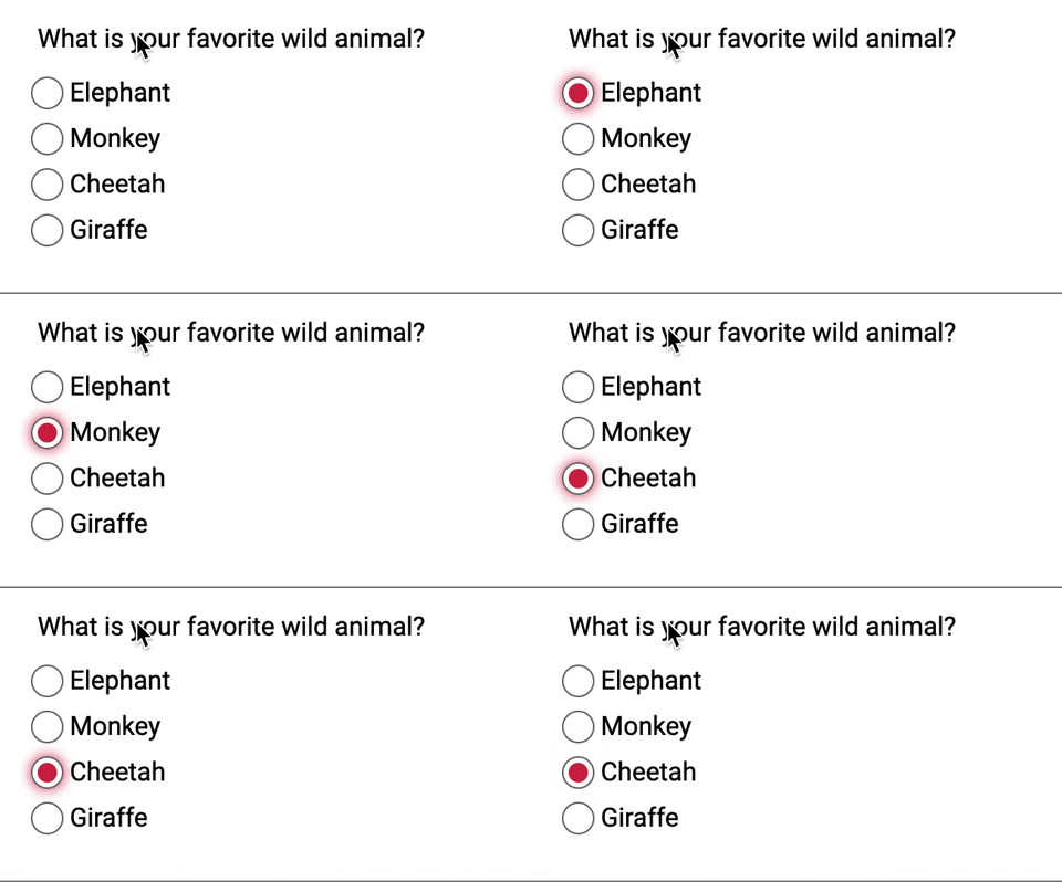
And Voilà!

Conclusion
When we make custom radio buttons, we have to make sure we account for the following:
- Creating proper HTML structure with associated form labels!
- Using pseudo-elements to create the custom-styled element
- Accounting for the
:checkedpseudo-class - Ensuring you can focus on the new radio button
- Use
opacity: 0to hide the radio button
If you want to play around with it, here is the finished CodePen!
EDIT:
I wanted to give a shout out to some feedback/help from some cool people from Twitter for helping me polish a few things. In particular, I wanted to shout out Elizabeth Schafer for forking this and making some tweaks for windows high contrast mode! Super cool!
If you liked this blog post and are interested in learning more about accessibility, take my 10 days of a11y free email course.
Cheers! Have a great week!
About Lindsey
Lindsey is an accessibility expert, JavaScript lover, and Front End Developer who's passionate about inclusivity both inside and outside the web. Read more about her on the About Page